Over the past week my partner and I have been working on the editing for our music video. For this, we have been using the programme 'Adobe Premier Pro'. We have had limited past experience with the programme, therefore using it this week has been a learning curve. We have made use of online tutorials and videos to help us achieve our desired effects. We also discovered how to apply these through experimentation with the software and asking our teacher. The effects we've been trying to apply this week were effects such as:
Sepia toning
Vignette
Cross processing
For the sepia toning, we added a yellow 'Colour Matte' layer over our video layer, and set the opacity to a reasonably low level. This layer gave our video a sepia 'tinge', which is what we wished to achieve to give our video an 'old' look.
The vignette we created was made in Adobe Photoshop, and then consequently imported into Premier. This was created through using the elipse tool, applying 'select > inverse' to the circle and then applying a gaussian blur to create a shaddow effect. We then removed the background and imported it into Premier, and added the vignette to our video clips.
We were unsure of how to create a 'cross process' in Premier, but through experimentation with the software we discovered that the colour adjustment tools were similar to the ones in Photoshop, which we are familiar with. Therefore, we searched 'Cross process filters in photoshop' on Google, and found the following tutorial:
In order to glean whether our music video will be successful upon production, my parter and I asked our target audience the following questions. We wanted to know if "indie" music listeners would be interested in watching the video, and if it sounded like a realistic and interesting idea. We also wanted to know if there would be any improvements that could be made, so that the finished product is as professional as possible.
1. Would you recognise this as an 'indie' video?
"Yes, I like the twist on the normal love story by using mimes"
"I think so, the vintage filters will make it look a bit different and isn't something you would see in the mainstream"
"I like the idea of the flashbacks, I think that makes it a bit indie because it's diverse"
2. Do you feel the video is aimed at your age range and would appeal to people of your age?
"I think it is definitely aimed at our age range, perhaps people from about sixteen to twenty, maybe a bit older"
"Yes I think it's definitely targeted at a teenage/young adult audience, I don't think older people would listen to this"
3. Does this video sound like the sort of video you'd see on the television?
"It sounds like the sort of video you'd see on the music channel 'NME', because it's a bit quirky"
"I don't think you would see it on mainstream video channels, but definitely more alternative ones"
"Yes, it also looks like the sort of video that would be very popular on the internet"
4. Would you watch it?
"It looks quite arty and that interests me"
"Yes I would, I like the band and the video looks interesting"
"Yes, I think the mime's would draw people in because it's unusual"
5. How would you improve it?
"Possibly have more variety in the flashbacks because the same ones are repeated quite a lot"
"I'm not sure, I like the ideas you already have"
After asking members of my target audience these questions, I feel optimistic about our music video and that it will appeal to "indie" music listeners. I agree with the comment "Possibly have more variety in the flashbacks because the same ones are repeated quite a lot", and as a result of this my partner and I will brainstorm more ideas for flashbacks that will correspond with the rest of the music video.
Our aim for today was to carry out the 'bedroom scene' shots:
"Bedroom Shots (Total of 11 shots = 44 takes)
Location: Milly's House
Estimated time: 1 Hour 30 Minutes (20 minutes set up, due to changes in location around the house and changes in camera angles, 1 hour filming, doing 4 takes of each shot, lighting check, 5 minutes test shots) Cast required: Vince, Sam and Milly"
The first video shoot ran successfully, and all the shots were recorded on a HD digital video camera in the intended location. We did have anticipated lighting issues, as we were unable to get hold of a lighting kit for today's shoot. We managed to overcome these issues, and created a "romantic" mise-en-scene with various lights to exaggerate the ambiance of the scene.
The shoot took less time than anticipated, therefore we managed to film shots for the chorus, where there will be a series of jump cuts with are 'mime' characters miming to the lyrics in the song. We were particularly pleased with these shots as we found an interesting backdrop for the shots which complied with the mise-en-scene for our music video. We also managed to create some stop-motion animation at today's shoot, using a Canon EOS DLSR and a tripod to keep the images smooth and realistic. We then used Windows Movie Maker to get an idea of how it would look when it is edited onto our video. The final outcome of this stop motion clip will be slightly different in the music video as it will be edited in Adobe Premier Pro, where the transition from one image to the next will be slightly faster.
Here are a few pictures of today's video shoot:
This is one of the photographs from one of the stop motion sequences, in which the black tear on Vince's face moves downwards to demonstrate his sadness.
This is the set for our 'bedroom scene'. We chose it for the interesting backdrop and black and white colour scheme which corresponds with the mimes costume and make-up. We added extra lights to make the scene look more ambient and atmospheric.
Our 'make-up artist' Emily doing the face paint for our female protagonist, Milly.
In our music video, the mise-en-scene is one of the most important factors as the plot for our music video is a stereotypical 'love story', however the French mise-en-scene and unusual costume will make our video comply to the 'indie' genre and make it more entropic.
Costume
For our music video we will use similar costumes to the ones we used for the print production, as we felt those worked successfully and therefore will come across well in the video. However, in our music video it will be incredibly difficult to edit make-up flaws throughout the clips, therefore when we are filming we want to ensure that the make-up looks as convincing as possible. For this reason, we have asked our close friend Emily Sparkes to do make-up for the music video as she is a very capable artist and we feel she would do a great job.
An example of art-work by our 'make-up artist'.
For the costumes, we will need:
1. Striped top/shirt
2. Braces
3. Black trousers/skirt
4.Top hat/beret
5. White face paint/black liquid eye-liner
6. Black or white gloves
7. Black footwear if it appears in the scene
Also, for the clown costume we will need:
1. Clown Mask
2. Checked shirt
3. Bow tie
- It is not necessary to use any other costume for this character as it will not be visible on camera.
Both my partner and I have made arrangements for the costume. Our actors already possess most of the clothing, however we have had to buy the make-up for the scene, and borrow other items such as the braces and the top hats.
Props and Location
The props we use in the video are equally important as the costume, as it will help add to the general look of the video as a whole. We have discussed the general feel we want our music video to have, and therefore we will endeavour to feature typical "1950's" or "French" props in our music video. These will be objects such as wind up telephones, accordions, playing cards, record players, old cigarette packets, etcetera.
Example of a "French" prop - My partner Leah owns an accordion and can provide it for our music video
Example of a '1950's' prop - these can be purchased on ebay or at vintage shops
The location of our video will be in various different places. These locations include:
1. The River Severn in Worcester: Running along side the River Severn is a cycle path and walk way, which is lined with trees and cathedral gardens. My partner and I saw this as an ideal setting for our 'bike' flashbacks, as the setting looks cultural and will look effective in our music video.
2. Café Rouge in Worcester: As this café is French, it will be ideal for our music video as it completely corresponds to themes we are trying to create. There is French lettering on the café walls, and the design of the restaurant also looks effective and artistic.
A picture of Café Rouge, Worcester
3. The house of our female protagonist, Milly Morris: We found the wallpaper and décor in this house corresponds well with out music video ideas and therefore will be ideal for indoor scenes such as the 'bedroom scene'. The walls are black and white and therefore will fit in with the 'mime' costume and make-up.
For our music video, we want to create an 'old look', therefore we looked into what colour filters will be applied. This 'old look' will help give the sense of reminiscence, which is one of the key themes in our music video. We wanted to achieve a look similar to the one created in this clip:
After carrying out research, this effect is often achieved by applying faint blue and yellow filters either to the camera when filming, or in post production whilst editing. I experimented with these filters on a photo to see if I could achieve the same effect. Here it the original photograph:
I then applied a 'Cross Process' filter, which was achieved by adding yellow yellow and blue filters on photoshop. I also adjusted the contrast slightly, so the image looks slightly more distinctive. Colour filters are something that can also be applied to film in Adobe Premier pro, therefore after previously experimenting with colour filters I will know which ones to apply.
Here is the 'Cross Processed' image:
In our music video we also want to apply a film grain effect where the flashbacks are used, to help portray the fact that these shots are flashbacks. We thought this would work more effectively than using effects such as a grayscale filter as it would look too abrupt in between the shots with colour. I experimented with film grain effects on Windows Movie Maker, utilising different strengths of the 'Film Age' effect to see which effect looked the most successful. I used a series of photographs similar to the shots we will take to apply these effects onto. Here is the result of my experiments:
From this I discovered that the 'Film Age (Older)' effect is the most successful. The 'Film Age (Old)' effect is barely visible in these clips and I feel that the change in the shots would not be distinctive enough for the audience to distinguish that those shots are flashbacks. On the other end of the spectrum, the 'Film Age (Oldest)' effect is too strong and makes the image difficult to see. As a result of these tests we will apply the 'Film Age (Older)' effect to the flashback clips in our music video.
Filming: Indoor Shots 1 - Saturday 7th January 2011
5.30 pm onwards
Potential problems: Camera Availability (busy time)
1. Bedroom Shots (Total of 11 shots = 44 takes)
Location: Milly's House
Estimated time: 1 Hour 30 Minutes (20 minutes set up, due to changes in location around the house and changes in camera angles, 1 hour filming, doing 4 takes of each shot, lighting check, 5 minutes test shots) Cast required: Vince, Sam and Milly
Filming: Indoor Shots 2 - Tuesday 9th January 2011
10.10am - 11.10am
Potential problems: Studio Availability
1. 'Photobooth' Shots (Total of 4 shots = 16 takes)
Location: Worcester Sixth Form College, photography studio
Estimated time: 30 minutes (5 minutes set up, 5 minutes lighting check, 20 minutes filming) Cast required: Vince and Milly
2. Head and shoulders 'miming' shots (Total of 5 shots = 20 takes)
Location: Worcester Sixth Form College, photography studio
Filming: Indoor Shots 3 - Tuesday 9th January 2011
6.30pm onwards
Potential problems: Public place, ease to film
1. Jump Cuts - Two Shots (Total of 13 shots = 39 takes)
Location: The Firefly, Worcester
Estimated time: 1 hour (5 minutes set up, 5 minutes lighting check, half an hour filming, allow 20 minutes for interruptions from people in a public place)
Filming: Outdoor Shots 1 - Wednesday 10th January
12.30pm
Potential problems: Unsuitable weather conditions
1. Hill shots, mime's running towards camera (Total of 3 shots = 12 takes)
Location: Rebecca Gardens, Worcester
Estimated time: 30 minutes (10 minutes set up and lighting check, 5 minutes test shots, 15 minutes filming, doing 4 takes of each shot) Cast required: Vince and Milly
2. Café Rouge shots, mime's at table (Total of 9 shots = 36 takes)
Location: Café Rouge, Worcester
Estimated time: 1 Hour (15 minutes set up due to changes in camera angles, lighting check, 5 minutes test shots, 40 minutes filming, doing 4 takes of each shot) Cast required: Vince and Milly
3. Bike shots (Total of 8 shots = 32 takes)
Location: River Severn, Worcester
Estimated time: 1 Hour (15 minutes set up due to changes in camera angles, lighting check, 5 minutes test shots, 40 minutes filming, doing 4 takes of each shot) Cast required: Vince and Milly
1. Point of view shots (Total of 5 shots = 20 takes)
Location: Worcester Sixth Form College
Estimated time: 20 minutes (5 minutes set up and lighting check, 10 minutes filming and retakes)
Filming: Indoor Shots 4 - Sunday 14th January 2011
1.00 pm onwards
Potential problems: Cast transport to location
1. Sofa Shots (Total of 18 shots = 72 takes)
Location: Leah's House, Worcester
Estimated time: 1 hour (15 minutes set up due to changes in camera angle, 5 minutes lighting check, 40 minutes filming)
Photography: Stop Motion Animation - Friday 8th January 2011
5.00pm onwards
No potential problems
1. Stop Motion animation of inanimate objects (accordion, back of cards, socks, gloves)
Location: Emma's House, Droitwich
Estimated time: 30 minutes (5 minutes set up and 25 minutes taking various pictures)
Over the past week, my partner and I have met with our two main cast members to discuss things such as:
Time Management - Dates of filming, which dates were compatible with both our protagonists to film together, deadlines, etcetera
Who will do what - For example, which scenes will feature who, their roles in this scenes, whether or not they will have to learn lyrics to mime, whether they are comfortable being filming in a particular setting, etc
Where the filming will take place, so the cast can plan transport to locations and whether they are able to get there
Costumes and props, what they will need to wear on set, etc
How many other people will be involved
The final concept idea for the music video
Contact details, phone numbers and email addresses so easy communication is maintained
We only have a small cast list, as follows:
Female Mime: Milly Morris
Male Mime: Vince Mccumisky
Clown: Sam Ruane
As a result of this, instead of making an "Event Page" on the social networking site "Facebook", we decided to simply meet with out cast in person and discuss dates, times, costumes, locations, etcetera. That way we would have a clearer idea of what times and dates suited everybody best, and it make it easier to discuss possible issues such as transportation from location to location. We needed to give the cast a basic idea of what music video is about, therefore we gave both of our blog addresses to iyr, so the cast list could easily view our concepts and ideas.
Our blogs include our finished print production tasks, which gives the cast the best idea of the general look of the video, as we both related our digipaks and adverts to the music video concept. Our blogs also incorporate things such as videos that have given us inspiration, 'indie' genre information, shot types we find interesting, film clips that have given us ideas for our music video, etc. To guarantee that our cast fully understood the concept, we created a mood board in which we tried to summarise the whole concept of the music video. For this mood board we used Adobe Photoshop to create a compilation of internet images and our photographs.
(moodboard photo here)
We will show our cast the animatic storyboard and final concept ideas once they are completed, so they fully understand which shots they will have to be in and what sort of role they place in the music video.
To gain more awareness of the use of shots in a music video, I decided to analyse a music video belonging to the same genre and decipher factors such as:
What sorts of shot are used (eg. close up, mid shot, etc)
How long each take is
Use of steadycam of handheld camera motion
Angles
Additional features such as post production effects, types of cut, etc
For this, I analysed the video 'Ooh La' by The Kooks, as not only does it belong to the same genre, but the general 'old' look of the video is quite similar to what we want to establish in our music video. I divided the video into each shot, and recorded the following notes:
0.11 CUTAWAY SHOT OF BAND MEMBER AND FEMALE (VIDEO BECOMES BLACK AND WHITE, MUSIC COMES IN)
0.12 MID SHOT OF BAND MEMBER, LOW ANGLE
0.14 EXTREME WIDE SHOT OF THE EIFFEL TOWER AND LEAD SINGER, CANTED ANGLE
0.15 CLOSE UP OF BAND MEMBER PLAYING GUITAR
0.17 LEAD SINGER WALKS TOWARDS THE CAMERA TO CREATE MID SHOT, MIMING TO LYRICS
0.20 LOW ANGLE SHOT OF BUILDINGS, HANDHELD CAMERA MOTION
0.21 HEAD AND SHOULDERS SHOT OF LEAD SINGER, HANDHELD CAMERA MOTION
0.22 HEAD AND SHOULDERS SHOT OF BAND MEMBER, HANDHELD CAMERA MOTION
0.23 HEAD AND SHOULDERS SHOT OF BAND MEMBER, HANDHELD CAMERA MOTION
0.24 WIDE SHOT OF BAND MEMBER AND FEMALE
0.25 CLOSE UP OF BAND MEMBER, HANDHELD CAMERA MOTION
0.26 CLOSE UP OF GUITAR
0.27 HIGH ANGLE SHOT OF BAND MEMBER, HANDHELD MOTION
0.29 MIXED FOCUS SHOT OF LIGHTS
0.30 WIDE SHOT OF LEAD SINGER, CANTED ANGLE
0.31 MID SHOT OF LEAD SINGER PLAYING GUITAR, STANDING ON ONE OF THE 'THIRDS' LINE
These notes helped me to create a 30 second animatic storyboard, so I could clearly decipher how long each shot lasted. This will also give me a better idea of what 'works' in a music video when I'm storyboarding our project.
After making this storyboard, I learned that in a music video there is almost one shot per second. This video contained 24 shots in the first 30 seconds, meaning that in the entirety of the video about 145 shots. We will have to replicate this number of shots in our music video to establish a professional outcome.
Particularly interesting factors I noticed in the music video was the use of the handheld motion on the camera. It gives the video a 'handmade' look, whilst still looking professional as steadycam shots are also incorporated. The use of colour at the beginning gave it an 'old' look, using either a blue tinted camera or post production effects to give a sense of old film. The transition into black and white indicated a change in mood, and also separated the introduction of the video from the main part. The use of black and white also helps it look old fashioned, and for us it would be a simple way to help us achieve this look. There is also a slight vignette applied to some of the clips, which also makes the video look older. There is a mix in clarity throughout the video, and in some parts the video is less focused than others, which continues to create an old impression. These are all factors that I will take into consideration when creating our music video.
Other inspiration
This clip is taken from the film 'Le Fabuleux Destin d'Amélie Poulin' (directed by Jean-Pierre Jeunet). I particularly like the way this sequence is shot, with the use of handheld camera motion and stop motion giving it an unpolished effect. There are occasional flashes of light which give it a sense of film grain, which often occurred in older filming. I like the use of the bike and camera travelling with it, it gives the sequence more depth. Although it would be tricky to incorporate this through filming, a similar effect could be applied in our music video by making use of stop motion animation.
This clip is the opening scene to the film 'Candy' (directed by Neil Armfield). I found this scene particularly inspiring, and it gave my partner and I the idea of featuring point-of-view 'spinning' shots in our music video. We would film these by spinning in time with the actor in focus, so the location behind them is spinning, whilst maintaining a clear view of the actor. This clip in 'Candy' is also a flashback, and inspired my parter and I to create flashbacks in our video, in order to give it a sense of reminiscence and keep the narrative moving forward.
Over the past few weeks, we have been discussing who would be suitable to use for a music video, taking into account factors such as:
Available free time from the actors
Confidence in front of a camera
Basic acting skills
Enthusiasm about working on the project
After considering various different people for the roles, we decided to use Vince Mccumisky as our male protagonist and Milly Morris as our female protagonist.
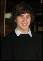
Vince Mccumisky: We decided to use Vince as he has previous experience in front of a camera, working on various film projects previously. Aesthetically he works well in the 'Mime' costume, therefore will help build on an effective mise-en-scene for the music video. As I used him for my digipak project, I discovered that he is very easy to work with and is flexible with timing, which will make things easier when creating a time-plan for the video. Also, the fact that he was used in my digipak project will make the digipak work and music video project correspond, therefore from the perspective of the target audience it's easily recognisable. He also has a very likeable personality which will make him easy and enjoyable to work with on the project.
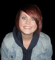
Milly Morris: We decided to use Milly as she is also a Media Studies student, therefore she has good understanding of shot types and what works well on a camera. She performs on stage regularly which means she's confident and knows how to give a good performance. She was used for my partner's digipak print production project, and she also works well with the 'mime' costume. It is extremely important that the actors' make-up and costume look effective in our music video as it will keep it looking professional. Both my partner and I are good friends with her and therefore she will be enthusiastic about donating time to work on the project.
As our music video is a twist on a typical love story, we decided to incorporate a scene in which the female mime is having an affair. To keep this affair fitting in with the rest of the music video, we decided to make the person in which the mime is having an affair with a clown. For this we needed another male actor:
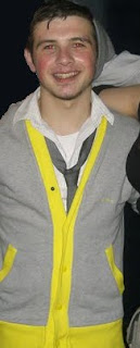
Sam Ruane: We decided to use Sam as he's in a band, meaning he has had previous experience performing in front of audiences and cameras. This will mean he is comfortable in front of a camera and therefore will put on a good performance. He is also a good friend of ours and the other actors in the video, therefore is willing to feature in the video and spend some time working on the project with us.
To see if my print production task was successful in appealing to my target audience, I created a 'focus' group and asked my target audience the following questions:
1. What do you think of the digipak?
"I really like it, it's a very interesting design and i like the "old style", the mime fits in with "indie" music genres and gives it a quirky style, it's very individual, I like the black and white contrasting with the bright red, and I like the effect on those pictures (points to inlay) where the two images are merged together"
"I think it's really good actually, it looks really professional. It's got a lot of the same character over and over, so it's got continuity and it looks like it could very well be sold as an actual album."
2. What genre do you think this is?
"I'd definitely say it was 'indie' cause it looks quite quirky, it looks like the sort of thing that only a select few people would know about"
"I'd say it was an indie, it's a bit off the mainstream, but it goes with the conventions of the indie genre"
3. What don't you like about the digipak?
"I think the font could be a bit lighter on the one panel, but apart from that i think it's really cleverly designed"
4. What do you think of the photos?
"The model looks really good, and I like the black and white contrasting with the red"
"They're quite creative, the models poses are interesting and they all look quite different"
The purpose of asking these questions was to find out if there could be any improvements made and if it would successfully sell as a media product. The results of my audience feedback showed that generally it appealed to my target audience and that they would be interested in buying it if they saw the product being distributed.
(The CD shape is used to indicate where the CD will go, it is not part of the design)
This is the final edit of my digipak design. I used the same background for the CD as the back cover as the images are small and some will be visable when the CD is in place. Because the background is quite busy, I decided to make my CD design simple, so there there isn't too much contrast and it doesn't look too complicated. This is the CD design:
For the design on the CD I used the elipse tool to create a circle within the CD template, then used the text tool to create text that follows a circular path. I looked at other CD's, and discovered they often incorporate the 'Compact Disc Digital Audio' symbol, along with the logo for the record company. Because of this, I included them on my design, along with numbers for the barcode and a bit of marketing information.
Also for my digipak, I created a leaflet to go inside, which features things such as producing information, 'thanks' and lyrics to the CD. Here is my final leaflet design:
(The black line is used to indicate where the fold is, it is not part of the design)
For this design, I didn't stick to my original plan where I would incorporate things such as the 'passport photo layout' I previously designed, and used fewer pages. This is because the lyrics utilised less space than originally planned, and a few of the layouts didn't look effective when applied on Adobe Photoshop. Because of this, I used a few of my original ideas, however adapted them to create a design that would look more effective. This leaflet would feature behind the bottom right hand panel (featuring lyrics) on my digipak, so this panel opens onto more images and lyrics. After researching into CD leaflets by other artists, I discovered there are features such as 'Artist Thanks', where a small paragraph of writing by the artist is included, thanking the people who gave them inspiration for the album. Other things incorporated in these leaflets were production and engineering information. Because of this, these things were also featured on my design, in order to achieve the most professional outcome possible.
For advertising for the digipak, we were asked to create an advert to feature in a music magazine. I chose to create a half page advert, as the band are relatively well known, however wouldn't feature on a full A4 page in a magazine. I incorporated magazine reviews, and chose to use the same image as the front cover of my digipak, to keep it recognisable for the audience (see previous blogs). This is my final design:
This is the first page for a leaflet that will come with my digipak. I used the clone stamp tool to edit the background and make it consistent behind the text, and used the font 'Rockwell Condensed' to write out the lyrics. The photograph was taken from previous editing.
For my magazine advert, I intended to create an image that would fill half the page of a page of a magazine. This was due to audience suitability. After researching into music magazine adverts that feature in 'indie' magazines such as NME, fairly well known bands such as 'Two Door Cinema Club' normally feature in a half page adverts, where as less well known bands will be featured in a smaller space.
This is an example of how my advert would appear in a magazine. 'The Drums' are a similar band to 'Two Door Cinema Club', therefore a similar style advert would be suitable for my design. It will have to feature things such as album reviews (in this image, there are short quotes such as 'effortlessly spectacular NME 8/10. It is important to use a believable quote source, and use magazines such as 'NME' to take quotes from, to fit in with the genre and appeal to the target audience). It also features things such as the record label logo, website information, and images. All of these things will be included in my advertisement design to keep it looking professional.
For this task, I had to carry out research into A5 page dimensions to make sure that the page size was accurate for a magazine. I used the following website to acquire this information:
I then had to enter these dimensions into Photoshop, in order to a canvas to work on that is an accurate size.
After this I begun work on my magazine advert. For this, I used the same image featured on the front cover of my digipak, so if my target audience saw the magazine advert the digipak would be easily recognisable. It also features the same font style, 'Rockwell Condensed', to continue to make the digipak and advert correspond with each other. The corner of the magazine advert features the logo for the record label 'Kitsuné', to advertise the record label as well as the band. This is a feature of many magazine adverts that I have previously seen, and therefore decided it was an important feature to have on my magazine advert. Here is my finished magazine advert:
After having looked at digipak's in the record shop 'HMV', I discovered that a lot of digipaks contain a booklet featuring images and lyrics from the album. As a consumer of these products, if I purchased a digipak I would rather it contained a booklet with further information, as I would be receiving more information about the band for my money. I would classify myself in the target audience, so in order to appeal to the target audience more I have decided to create a booklet to be featured with my digipak. This booklet will contain lyrics, and a few more mime edits. It will also contain things like producer information, fan club information, management information, etc.
This booklet mostly consists of lyrics, and images that relate to the album art. A similar format will correspond with my digipak design as lyrics are featured on the right inside cover. This is where the booklet will be, and the cover of the booklet will simply be the image featured on the right inside cover, so the rest of the album's lyrics are featured in the booklet behind it. The booklet will feature photograph edits that have not already bene incorporated into the digipak design, which will be lain out in formats like the 'polaroid picture' and 'passport photos' that I previously researched. This is a sketched out plan of what the leaflet will look like :
Over the past few days I have begun combining my photo edits, font tests and research in order to create my digipak. After testing out several fonts I decided to use a standard font called 'Rockwell Condensed', as I found a more decorative font had a less professional look in conjunction with the photographs. After experimenting with arrangements of photographs, I decided to use a series of close-up head shots for the back cover, as it looks interesting and varies to the other two panels, which only contain one image. I have included a bar code to make it look more professional, and kept to the colour scheme of red, black and white to keep it simplistic and professional looking. I experimented with drop shaddows on the font, but discovered it looked 'over the top' and left the font in it's original form. I used the 'clone stamp tool' and the 'lassoo tool' to merge two images together, to make the panel more entropic and interesting.
For my final design, I have decided to pursue the 'mime' idea, as it will correspond with the music video that we intend to produce in January. In order to make my digipak look entropic and 'indie', I intend to manipulate these images further in order make it interesting and aesthetically pleasing for my target audience. It is crucial that I vary the way in which the images are displayed as facial close-up shots are very common with mainstream album art, which is an image which I do not want to portray. Here are some ideas I came up with:
Polaroid Pictures
Creating a polaroid frame would build on the 'old fashioned' look that we wish to establish in our music video, therefore incorperating similar ideas into my digipak/magazine advert would correspond and build on audience appeal. It would also add more variation to the design, whilst keeping the basic pictures similar to one another, which is common and successful with digipak designs.
Passport Photos
I feel using a 'passport photo' layout on one of the panels for my digipak would work effectively, as likewise to the polaroids, it would add variation and make a more diverse and interesting digipak. I feel this would be particularly effective as I have several close-up facial shots of my 'mime' model pulling different facial expressions. The effect of these in a 'passport photo layout' would be entropic, as it unexpected to see a mime in passport photos, therefore it would build on the 'indie' genre by being different.
Here is a basic idea of what this would look like. I desaturated the layer slightly in order to make it look more 'old fashioned' and dimmed the brightness. I think this would work successfully for one of the panels of my digipak.
Another idea was to have a long strip of images, and have them repeated several times to create a block of pictures. I feel this would be a good idea for the back of my digipak, as this block of pictures could fill half of the digipak and the other half would be filled by track listing, bar codes, small print, etc. This is a basic idea of what this would look like:
Gender: Male and female, we decided that members of an 'indie' audience are equally as likely to be male as female.
Typical hobbies: Going to gigs, playing instruments such as guitar and drums, going to the cinema, drinking, smoking, driving, painting, writing music etc.
Other Media Consumption:The target audience would buy music magazines such as NME and Q, and watch music channels like ‘NME TV’ and ‘MTV Rocks’. They would also listen to radio stations such as ‘Virgin Radio’ and ‘Kerrang’. Websites such as ‘Last.Fm’ and ‘Spotify’ would also be useful for the audience as they allow them to find new and interesting artists.
Consumption Patterns:Would typically shop at stores such as ‘Topshop/Topman’, but would avoid most chain stores. Enjoys eating Subway sandwiches and would download independent films such as ‘Juno’ and ‘Eternal Sunshine of the Spotless Mind’. Would drive a Vespa moped and would usually buy records at a record store, would use the internet to find out about new bands.
Typical Music Interest: Two Door Cinema Club, The Kooks, The Maccabees, Los Campesinos, Bombay Bicycle Club, Hot Chip, Vampire Weekend, Good Shoes, etc.Would typically go for 'underground' artists produced by indie record labels, as opposed to 'polished' mainstream artists who convey a 'perfect' image. These people are more likely to illegally download music in bulk, and pay for merchandise, gigs/festivals and music magazines instead. For this reason, the digipak and advert would have to be as eye-catching as possible to encourage them to purchase it, and must appeal to their demographic as much as possible.
I published several 'mime' photographs to the social networking site 'Facebook' and tagged members of my ideal target audience in the photos. I have asked them to answer the following questions regarding the photographs:
1. Do these images comply to the indie genre? 2. Do these images look interesting/entropic? 3. Would they be suitable for album art or a magazine advert? 4. If you saw a digipak with these images used on the album art, would you be interested in buying it? 5. What could be done to make these images more suitable for a magazine advert or digipak?
Here are some of the responses I gained:
1) yeah 2) yes, especially his facial expression and the make up 3) yes because it's weird ... so you would be intrigued 4) yes 5) i don't know, its really good already :)
1. i don't think so really, it's not really what i think of when i think indie. 2. yes. 3. advert more than album art i think :) 4. possibly. 5. i don't know really
1) yes 2) yes, especially the costume/makeup thing you got going on 3) yes 4) yes 5) maybe something more eye catching, like making the hat red or something.
These responses are useful for the production of my digipak, and I'm going to take the comments on board when creating my final design. I am going to work on the comment stating "it's not really what I think of when I think indie", and incorporate different fonts and photo arrangements to ensure the final design corresponds with the genre.
Following my album art and digipak research, I decided to carry out too lots of test shots to see what would look the most effective. The first test I did was to replicate a 'hand-made' digipak, which would comply to the indie genre by looking 'unpolished'.
This is an unfinished version of a potential album cover, for which I used coffee
stained paper for the background,
which was then scanned into the computer. I used a digital SLR to take pictures of every day things such as signs, clocks, post boxes, etc. This was to comply
with the title 'this is the life' as it shows things that people see and experience on a day to day basis. I then imported the photographs into photoshop and used the magic w
and tool, lasoo tool and the eraser tool to remove the background from the image.
Here is an example of one of the images:
After removing the backgrounds from each of the images, I copied and pasted the images onto the image with the coffee stained paper, and used the saturation tool to desaturate the images, making them look less vivid and give them an 'older' look. I also decreased the brightness on each of the i
mages to
carry out a similar effect. I used the logo from the logo tests I had previously done, and used a colour scheme which
corresponds with the background. In the potential finished image, most of the space along the base line of the album art would be filled, and there would be further editing to the logo design to make it look more eye-catching and easy to read.
The second test I did was to create a slightly more 'polished' cover which would feature more edited photography. For these shots, I used face paint and costume on my model to create a mime character. This was to comply with our basic idea for our music video, which will tell the tale of two mime characters falling out of love. These shots were taken in a photography studio with professional lighting and a DSLR camera.
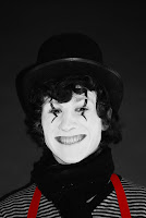
This is one of the images that I took, before it was edited in photoshop. When editing, I liked the black and white colours, however found the red-braces looked effective. In order to keep the braces red, I used the magic wand tool and copy and pasted the braces into a separate layer to the rest of the image. I then desaturated the first layer completely, to create a black image. I used the 'brightness/contrast' option to make the contrast between the black and the white more distinctive. I also used t
he 'burn' tool to make black eye make-up clearer, and used the cone-stamp tool to polish untidy parts of the image.
Here is the edited version:
I took a series of photographs with this model at various different angles, and carried out the same edits to create images that were fairly similar to one another. Here are some more edited images: