Monday 29 November 2010

Technology Skills - Targets.

  • Get more familiar with Adobe Premier Pro, therefore when it comes to the editing of my final music video i will know how to effectively use the tools on the program. At present I am unsure on how to apply a slow/fast motion effect to a video clip, or how to incorporate stop motion animation onto a video using this particular programme. I also need to experiment with creating successful jump cuts and continuity edits. Additionally, I need to practise creating an effective lip sync by experimenting with video clips and sound. This is to ensure that my final video looks professional and believable. I will follow online tutorials in order to do this and develop my knowledge.
  • Familiarise myself with the digitial video cameras more, so I can professionally apply a variety of shots such as dolly, tracking, zoom in/out etc. This will be achieved through experimenting with the camera and taking test shots to see what works the best.
  • Learn how to successfully use different settings on a DSLR so photographs can be taken more professionally. These are settings such as landscape, close-up, sports, night portrait, etc. The aim of this is so photographs will look more effective before they are edited in Photoshop, to ensure the most professional outcome possible. This will also be achieved through experimentation and taking test shots.

Friday 26 November 2010

Creativity.

This week we had to undergo a creative task, where we experimented with creative technologies such as Adobe Photoshop and Digital SLR's to trigger ideas and inspire us to create a successful digipak and poster later on in our coursework task. I used this time to experiment with different fonts in order to create an effective logo which will later be incorporated onto my final design. I experimented with various different fonts, ranging from serif fonts to decorative, and from this developed further ideas about what my digipak and poster will look like. Here are some of the ideas I experimented with:

With this logo I used a font called 'Myriad Pro', and featured very small leading and 'condensed bold' text to make it look compacted. It is a sans serif font and this logo only uses
upper-case lettering, which along with the black and white colour scheme keeps it simplistic and easy to read. However, I do not think I will use this design in the final task as it looks quite 'polished' and I'm trying to establish an unpolished 'indie' look.

This logo is very different from the previous one, and for this one I used a font called 'Courir New' which looks like type-writer lettering. The font is a serif font which keeps it looking fairly old, and I also used a brown colour scheme to continue to exaggerate this 'old' loo
k. I also experimented with kerning to keep it looking alternative. Although this logo is still fairly simplistic, I think it corresponds to the indie genre more successfully than the previous design as it looks 'unpolished'. I intend to use a design similar to this in my final digipak design.

Also throughout the creative task this week I carried out research into other album art produced by indie bands. In my opinion, the most successful covers looked fairly hand-made and didn't feature highly edited photographs like the photographs often used with mainstream artists. Here are some of the covers I found them most successful:
In this design I particularly like the background, as it looks 'vintage' and old fashioned. If I created a background similar to this it would correspond with the 'indie' look I'm trying to establish with my design. I like the colour scheme used, it keeps the design looking simplistic and effective and the serif font corresponds with the old-fashioned look.


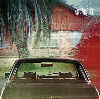
This another piece of album art which is used by an Indie band called 'The Arcade Fire'. I like this design cause it also looks fairly old fashioned, due to the 'posterised' effect which is applied to the photographs. If I were to incorporate photography into my design I would use Adobe Photoshop to establish a similar look to this one, and would use the saturation tool to dim the colours and give it an 'unpolished' look. Again, this design is fairly simplistic, with the logo kept fairly discrete in the corner of the design.


Yet again this album art is very
simplistic, with the sans se
rif text kept central on the design. I like the background featured as it looks handmade and again 'unpolished'. There is no particular colour scheme utilised on this which continues to build on the 'unpolished' look, which again corresponds with the 'indie' genre.

As a result of the album art research, I decided to experiment with backgrounds. Here are some of examples of backgrounds I created:

I liked the old-looking background used on the "northern lights" album art, therefore I tried to create a similar effect on this background. For this I simply painted coffee over some paper and used a scanner to get the image on photoshop, then applied the desaturation tool to make it less bright and vivid.



For this background, I used the background I had made for the previous one but used Adobe Photoshop to edit it and give it a 'pop art' effect.

Initially I applied a 'clouds' filter above the paper layer, then changed the blending mode to 'hard light' and the opacity to 45%, so it looked like it was part of the paper.
Then I created a triangle shape using the line tool, and duplicated the layer whilst using the transform tool to create the 'burst' shape on the picture. To blend the shape with the rest of the image I changed the blending mode to 'Overlay' and changed the opacity to 32%.


Sir Ken Robinsons theory about Creativity.
In this video Sir Ken Robinson discusses creativity and how it happens. He states that "I do not mean to say that being wrong is the same thing as being creative. But what we do know is, if you're not prepared to be wrong, you'll never come up with anything original." What he means by this is that in order to create something original and creative, mistakes have to made to establish this. Creativity is achieved by sensory perception, meaning that in order to generate ideas you'll need to hear something, see, smell, touch or taste something in order to inspire you and create something original and innovative. He also states that creativity is something we are born with, and as you grow older you begin to lose creativity. This is because as people grow older, they establish a better idea of what is "right" and "wrong", thus will deliberately avoid making mistakes. I agree with the statements that Ken Robinson has made, and in this previous week I have had to make a variety of mistakes using Adobe Photoshop in order to learn what looks good and what does not, in order to create an outcome I am happy with. I also agree that inspiration is caused by sensory perception, as I usually come up with ideas whilst listening to music or after seeing something that I find aesthetically pleasing.

Wednesday 17 November 2010

Time Management - Target Audience research.

18th November - Decide on candidates for focus group - Leah
18th November - Decide on questions that we will ask our target audience - Emma
20th November - Send a survey to our candidates via 'Facebook' requesting responses to moodboard, opinion on similar music videos from our genre and their synaesthetic imagery in response to our song - Emma and Leah
22nd November - Write up audience response on blog and assess whether plans need changing. Also judge whether aspects of our video need changing following the audience response - Emma and Leah

Friday 12 November 2010

Further Research: Mime Artists, The Soundies and Scopitones.

Mime Artists

For our music video we intend to tell a fairly conventional love story of two people going through a hard time in a relationship, but with a bit of a twist. We intend to make these two people mime artists, to create an alternative tale to the conventions portrayed in mainstream media, whilst making it comply to the indie genre by being 'different'. Our initial inspiration for this idea came from the film 'Paris Je T'aime' which is a French film featuring a variety love stories in Paris. One of the stories told is about two mime artists and the clip is embedded below.


Definition and history
A 'mime artist' is someone who uses mime as a theatrical medium and uses mime and body motion instead of speech. Mime is established through silent comedy, and in the nineteenth century in Paris, Jean-Gaspard Deburau established the mime character that is well known in modern society: the white faced mime. The twentieth century bought motion picture, a new medium for mime artists. Due to the lack of technology in the early twentieth century, minimal speech could be used in filming therefore mime became a popular platform. Charlie Chaplin became a famous silent film comedian, and became one of the most documented mimes in history.


Although this clip is not the exact mime character we are aiming to establish in our music video, the old film style and general mise-en-scene is similar, as well as other features such as the actors over-dramatic facical expression and bodily language to demonstrate emotion. This clip is in monochrome due to the early period in which is was filmed, and also there are very basic shots used, ranging mostly between two-shots and mid shots. These are kept constant in order to keep the portrayal of the actors emotion simple and understandable for the reader, as in the time this was filmed post production effects and camera techniques utilised in modern technology weren't really established. We aim to replicate this era in our music video to give it an individual and interesting feel, whilst contradicting the polished and perfect look portreyed in mainstream music videos. This old fashioned film style occured in early film from around the 1910's onwards. These films were influencial towards other media platforms in the future, and therefore in the 1940's, the 'Soundies' were born.

The Soundies
The soundies were an early version of music video, which were produced in places such as Hollywood, New York and Chicago in the 1940's. They were played on jukeboxes called panorams or scopitones and played in bars, pubs and clubs. Soundies covered all types of music, from big band swing to patriotic songs. Popular artists of that time such as Doris Day, Lawrence Welk, Gale Storm, Kay Starr and many more made Soundies.


This film style again features the monochrome film grain look which we are aiming to achieve in our music video. Also similarly to the Charlie Chaplin clip, this video features fairly basic shots, made up of mostly mid shots and wide shots to show the dancers clearly. As opposed to the average music video nowadays which will usually feature around 250 shots whereas this particular video only features around 20. This is due to the technology at the time, as they would not have had the facilities to create fast paced and effective continuity editing like in modern videos. In our music video we are going to take inspiration from these clips in the sense of creating an old fashioned film look, however we are going to feature a more varied range of shots to keep it modern and interesting. We feel that these influences in our video will help the video correspond with the indie genre and appeal to the demographic of our target audience as it would oppose the polished images portrayed in mainstream modern videos.

Thursday 11 November 2010

Post-Pitch.

This was the power point presentation for our Music Video pitch.


The majority of the feedback from our music video pitch was positive, people particularly liked the stop motion test shoot and the mime idea as the focal point. We received comments such as:
"Use of stop motion - this adds another dimension to the video. Mime characters are certainly original."
"Using mimes to tell the story is very unique"
"Puts a twist on the indie conventions"
Some concerns that our audience had were regarding the choice of our target audience demographic, stating that the range of our target audience profile was too large. On our pitch we stated that the target audience would be between A and C2 on the Jicnars scale, but as our target audience were mostly students the placement of our audience on the Jicnars scale would be based around their parents income. We did a survey of our class and we discovered that students who had parents with a higher income were equally as inclined to listen to the music as students with parents earning a lower income. As a result of this, we decided to keep the target audience demographic the same as it is accurate.
Another piece of constructive criticism we received was about the logistical arrangements of our music video filming. In our pitch we stated that we would do some filming in a place called 'Friar Street' in Worcester due to it's old cobblestone style which'll fit in with our video effects such as film grain which also give it an old feel. The audience thought this was a good idea, however they stated that it could be awkward for filming as it's a public place and it would be difficult to keep the filming space clear. As a result of this we decided to film on a week night in the early evening because there would be fewer pedestrians there and would provide a softer light which would create a more effective mise-en-scene in the video.

Monday 1 November 2010

Music Video Auteurs.

Music Video Auteurs: Michel Gondry
Michel Gondry is a french film, music video and comercial director, and has won many awards for his screen writing. He is also well known for his manipulation of mise-en-scene, and has a famous portfolio of work including:

Film
- Eternal Sunshine of the Spotless Mind (below)
- Be Kind Rewind
- Human Nature


Although this clip is just a trailer, it shows a wide range of the shots that are featured in the film. I particularly like the use of master shots featured in this trailer, which show the position of the actors in various different locations. These shots demonstrate the very interesting and individual mise-en-scene featured in the film, which'll contribute towards the appeal to the target audience. We aim to create a similar feel, using interesting locations to establish a unique mise-en-scene, keeping our video different and thus complying to the 'indie' genre. The use of sound in this is different to what it would be in a music video, as it is a film and features mostly diegetic sound. However, it does feature non-diegetic sound, and this non-diegetic music adds an extra layer of meaning to the clips. In our music video we hope that the music used will add extra meaning to the clips being shown, making it comply to Andrew Goodwin's narrative theory by being amplifying. In this clip I also find the use of post production effects to be very impressive, using effects such as fast motion to show the passing of time. This is an effect which I feel would work effectively in our music video as it looks striking and artistic. In my opinion it is a good way to keep the narrative moving forward as it gives the impression of passing time by only using a few seconds of clip. As a music video is only a few minutes long, this would work well and stop the video from being slow-paced and uninteresting. I also like the graphic match where it the clip cuts from one house to another, as it looks seamless and entropic. Although I really like this feature and find it effective, I think it would be very difficult to apply to our music video as it would involve using a create deal of post production effects and very accurate shooting on the digital video camera. Close-ups in this video help establish the actor's emotions, which works successfully as you can see their facial expressions more clearly. This can easily be incorporated into our music video and will be done to help keep the narrative moving forward by making the story more understandable.

Music Video
- Hardest Button to Button (The White Stripes)

This music video uses a great deal of jump cut editing, which is a sequence of two or more shots where the camera position or image only moves slightly from clip to clip. The effect of this contradicts 'continuity editing' as it creates a very disjointed feel to the video. Generally the editing will not comply to the "30 degree rule" which is used to make continuity editing look 'flawless' and 'invisible'. This video however is made up of 'spatial jump cuts' which is where the cut between two images is not abundantly different to the previous shot. Although the fact that the musicians are playing their instruments along to the music is a very redundant feature in a music video, the use of post production effects give the video a great sense of entropy, keeping it interesting for the intended audience. This means that this video also comply's to Andrew Goodwin's narrative theory, as it has both literal features (such as the artists miming along to the music) and features that add extra meaning to the song (jump cut edits). These factors combined make the video amplifying, thus keeping it original and interesting whilst being understandable for the audience.

- Mad World (Gary Jules)


This video is different to the previous couple because it gives the impression of one continuous shot. This means there is no need for continuity edits between shots and the camera simply pans from place to place so the audience see more than just one view. Towards the very beginning of the music video we see an aerial shot, which is fairly entropic for a music video as they usually feature close-ups and wide-shots to give more detail about the band/people featured in the video. It's fairly simplistic, and just has a few people moving to create shapes from a birds-eye view. This is also quite entropic and therefore relates the lyrics "it's a very very mad world", however in my opinion there is not enough link with the lyrics and the video and therefore would classify it as 'disjunctive' using Andrew Goodwin's narrative theory.

- Walkie Talkie Man (Steriogram)


This video is made up of a lot of stop motion animation, which gives the impression of inanimate objects moving. This is a technique we're definitely going to employ in our music video as it looks entropic and interesting, and will give an extra layer of meaning to the music video. It looks particularly effective in this video as each picture is featured for a very short time frame which allows the animation to look fairly smooth. Fast motion is also applied in various parts to make the time frames even shorter, giving it a 'fast forwarded' effect. There is use of diegetic sound in this music video towards the beginning, and also in the middle of the video where it gives the impression of a television. When this is incorporated into a music video it is usually to contribute towards the narrative, and it plays this purpose in this video. It also keeps it understandable from the point of view of the audience, as without the diagetic sound the 'television' would probably be unrecognisable. This video is also fairly entropic as although the band are playing instruments along with the music, the instruments are made from wool, to fit in with the rest of the video. For this reason, I would classify this video as 'amplifying', as it does feature some redundant features such as band miming, however the 'knitted' element to the video does not relate to the lyrics and therefore adds an extra layer of meaning and entropy.

In conclusion, the work he produces is quite eccentric and entropic, setting his work apart from other music video auteurs by being interesting and original. The music videos he produces mostly follow Andrew Goodwin's narrative theory by being amplifying, meaning that the music video's have some relation to the song whilst having ulterior meanins and ideas portrayed in his work.