Thursday 30 December 2010

Music Video Cast.

Over the past few weeks, we have been discussing who would be suitable to use for a music video, taking into account factors such as:
  • Available free time from the actors
  • Confidence in front of a camera
  • Basic acting skills
  • Enthusiasm about working on the project
After considering various different people for the roles, we decided to use Vince Mccumisky as our male protagonist and Milly Morris as our female protagonist.


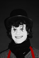
Vince Mccumisky: We decided to use Vince as he has previous experience in front of a camera, working on various film projects previously. Aesthetically he works well in the 'Mime' costume, therefore will help build on an effective mise-en-scene for the music video. As I used him for my digipak project, I discovered that he is very easy to work with and is flexible with timing, which will make things easier when creating a time-plan for the video. Also, the fact that he was used in my digipak project will make the digipak work and music video project correspond, therefore from the perspective of the target audience it's easily recognisable. He also has a very likeable personality which will make him easy and enjoyable to work with on the project.


Milly Morris: We decided to use Milly as she is also a Media Studies student, therefore she has good understanding of shot types and what works well on a camera. She performs on stage regularly which means she's confident and knows how to give a good performance. She was used for my partner's digipak print production project, and she also works well with the 'mime' costume. It is extremely important that the actors' make-up and costume look effective in our music video as it will keep it looking professional. Both my partner and I are good friends with her and therefore she will be enthusiastic about donating time to work on the project.

As our music video is a twist on a typical love story, we decided to incorporate a scene in which the female mime is having an affair. To keep this affair fitting in with the rest of the music video, we decided to make the person in which the mime is having an affair with a clown. For this we needed another male actor:

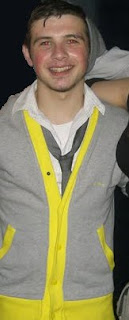
Sam Ruane: We decided to use Sam as he's in a band, meaning he has had previous experience performing in front of audiences and cameras. This will mean he is comfortable in front of a camera and therefore will put on a good performance. He is also a good friend of ours and the other actors in the video, therefore is willing to feature in the video and spend some time working on the project with us.

Saturday 18 December 2010

Audience Feedback to Print Production Work.

To see if my print production task was successful in appealing to my target audience, I created a 'focus' group and asked my target audience the following questions:

1. What do you think of the digipak?
"I really like it, it's a very interesting design and i like the "old style", the mime fits in with "indie" music genres and gives it a quirky style, it's very individual, I like the black and white contrasting with the bright red, and I like the effect on those pictures (points to inlay) where the two images are merged together"
"I think it's really good actually, it looks really professional. It's got a lot of the same character over and over, so it's got continuity and it looks like it could very well be sold as an actual album."

2. What genre do you think this is?
"I'd definitely say it was 'indie' cause it looks quite quirky, it looks like the sort of thing that only a select few people would know about"
"I'd say it was an indie, it's a bit off the mainstream, but it goes with the conventions of the indie genre"

3. What don't you like about the digipak?
"I think the font could be a bit lighter on the one panel, but apart from that i think it's really cleverly designed"

4. What do you think of the photos?
"The model looks really good, and I like the black and white contrasting with the red"
"They're quite creative, the models poses are interesting and they all look quite different"

The purpose of asking these questions was to find out if there could be any improvements made and if it would successfully sell as a media product. The results of my audience feedback showed that generally it appealed to my target audience and that they would be interested in buying it if they saw the product being distributed.

Friday 17 December 2010

Finished Print Production.

(The CD shape is used to indicate where the CD will go, it is not part of the design)

This is the final edit of my digipak design. I used the same background for the CD as the back cover as the images are small and some will be visable when the CD is in place. Because the background is quite busy, I decided to make my CD design simple, so there there isn't too much contrast and it doesn't look too complicated. This is the CD design:

For the design on the CD I used the elipse tool to create a circle within the CD template, then used the text tool to create text that follows a circular path. I looked at other CD's, and discovered they often incorporate the 'Compact Disc Digital Audio' symbol, along with the logo for the record company. Because of this, I included them on my design, along with numbers for the barcode and a bit of marketing information.
Also for my digipak, I created a leaflet to go inside, which features things such as producing information, 'thanks' and lyrics to the CD. Here is my final leaflet design:

(The black line is used to indicate where the fold is, it is not part of the design)

For this design, I didn't stick to my original plan where I would incorporate things such as the 'passport photo layout' I previously designed, and used fewer pages. This is because the lyrics utilised less space than originally planned, and a few of the layouts didn't look effective when applied on Adobe Photoshop. Because of this, I used a few of my original ideas, however adapted them to create a design that would look more effective. This leaflet would feature behind the bottom right hand panel (featuring lyrics) on my digipak, so this panel opens onto more images and lyrics. After researching into CD leaflets by other artists, I discovered there are features such as 'Artist Thanks', where a small paragraph of writing by the artist is included, thanking the people who gave them inspiration for the album. Other things incorporated in these leaflets were production and engineering information. Because of this, these things were also featured on my design, in order to achieve the most professional outcome possible.

For advertising for the digipak, we were asked to create an advert to feature in a music magazine. I chose to create a half page advert, as the band are relatively well known, however wouldn't feature on a full A4 page in a magazine. I incorporated magazine reviews, and chose to use the same image as the front cover of my digipak, to keep it recognisable for the audience (see previous blogs). This is my final design:

Wednesday 15 December 2010

Leaflet: First Page

This is the first page for a leaflet that will come with my digipak. I used the clone stamp tool to edit the background and make it consistent behind the text, and used the font 'Rockwell Condensed' to write out the lyrics. The photograph was taken from previous editing.

Monday 13 December 2010

Magazine Advert.

For my magazine advert, I intended to create an image that would fill half the page of a page of a magazine. This was due to audience suitability. After researching into music magazine adverts that feature in 'indie' magazines such as NME, fairly well known bands such as 'Two Door Cinema Club' normally feature in a half page adverts, where as less well known bands will be featured in a smaller space.
This is an example of how my advert would appear in a magazine. 'The Drums' are a similar band to 'Two Door Cinema Club', therefore a similar style advert would be suitable for my design. It will have to feature things such as album reviews (in this image, there are short quotes such as 'effortlessly spectacular NME 8/10. It is important to use a believable quote source, and use magazines such as 'NME' to take quotes from, to fit in with the genre and appeal to the target audience). It also features things such as the record label logo, website information, and images. All of these things will be included in my advertisement design to keep it looking professional.

For this task, I had to carry out research into A5 page dimensions to make sure that the page size was accurate for a magazine. I used the following website to acquire this information:


I then had to enter these dimensions into Photoshop, in order to a canvas to work on that is an accurate size.

After this I begun work on my magazine advert. For this, I used the same image featured on the front cover of my digipak, so if my target audience saw the magazine advert the digipak would be easily recognisable. It also features the same font style, 'Rockwell Condensed', to continue to make the digipak and advert correspond with each other. The corner of the magazine advert features the logo for the record label 'Kitsuné', to advertise the record label as well as the band. This is a feature of many magazine adverts that I have previously seen, and therefore decided it was an important feature to have on my magazine advert. Here is my finished magazine advert:


Digipak in progress.


After having looked at digipak's in the record shop 'HMV', I discovered that a lot of digipaks contain a booklet featuring images and lyrics from the album. As a consumer of these products, if I purchased a digipak I would rather it contained a booklet with further information, as I would be receiving more information about the band for my money. I would classify myself in the target audience, so in order to appeal to the target audience more I have decided to create a booklet to be featured with my digipak. This booklet will contain lyrics, and a few more mime edits. It will also contain things like producer information, fan club information, management information, etc.


This booklet mostly consists of lyrics, and images that relate to the album art. A similar format will correspond with my digipak design as lyrics are featured on the right inside cover. This is where the booklet will be, and the cover of the booklet will simply be the image featured on the right inside cover, so the rest of the album's lyrics are featured in the booklet behind it. The booklet will feature photograph edits that have not already bene incorporated into the digipak design, which will be lain out in formats like the 'polaroid picture' and 'passport photos' that I previously researched. This is a sketched out plan of what the leaflet will look like :


Saturday 11 December 2010

Screen Grab.


Over the past few days I have begun combining my photo edits, font tests and research in order to create my digipak. After testing out several fonts I decided to use a standard font called 'Rockwell Condensed', as I found a more decorative font had a less professional look in conjunction with the photographs. After experimenting with arrangements of photographs, I decided to use a series of close-up head shots for the back cover, as it looks interesting and varies to the other two panels, which only contain one image. I have included a bar code to make it look more professional, and kept to the colour scheme of red, black and white to keep it simplistic and professional looking. I experimented with drop shaddows on the font, but discovered it looked 'over the top' and left the font in it's original form. I used the 'clone stamp tool' and the 'lassoo tool' to merge two images together, to make the panel more entropic and interesting.

Thursday 9 December 2010

Fonts.

Image Manipulation.

For my final design, I have decided to pursue the 'mime' idea, as it will correspond with the music video that we intend to produce in January. In order to make my digipak look entropic and 'indie', I intend to manipulate these images further in order make it interesting and aesthetically pleasing for my target audience. It is crucial that I vary the way in which the images are displayed as facial close-up shots are very common with mainstream album art, which is an image which I do not want to portray. Here are some ideas I came up with:

Polaroid Pictures
Creating a polaroid frame would build on the 'old fashioned' look that we wish to establish in our music video, therefore incorperating similar ideas into my digipak/magazine advert would correspond and build on audience appeal. It would also add more variation to the design, whilst keeping the basic pictures similar to one another, which is common and successful with digipak designs.


Passport Photos

I feel using a 'passport photo' layout on one of the panels for my digipak would work effectively, as likewise to the polaroids, it would add variation and make a more diverse and interesting digipak. I feel this would be particularly effective as I have several close-up facial shots of my 'mime' model pulling different facial expressions. The effect of these in a 'passport photo layout' would be entropic, as it unexpected to see a mime in passport photos, therefore it would build on the 'indie' genre by being different.

Here is a basic idea of what this would look like. I desaturated the layer slightly in order to make it look more 'old fashioned' and dimmed the brightness. I think this would work successfully for one of the panels of my digipak.


Another idea was to have a long strip of images, and have them repeated several times to create a block of pictures. I feel this would be a good idea for the back of my digipak, as this block of pictures could fill half of the digipak and the other half would be filled by track listing, bar codes, small print, etc. This is a basic idea of what this would look like:


Audience Research: Digipak

Target Audience Profile

Age Range: 14 - 25 years old
Gender: Male and female, we decided that members of an 'indie' audience are equally as likely to be male as female.
Typical hobbies: Going to gigs, playing instruments such as guitar and drums, going to the cinema, drinking, smoking, driving, painting, writing music etc.
Other Media Consumption: The target audience would buy music magazines such as NME and Q, and watch music channels like ‘NME TV’ and ‘MTV Rocks’. They would also listen to radio stations such as ‘Virgin Radio’ and ‘Kerrang’. Websites such as ‘Last.Fm’ and ‘Spotify’ would also be useful for the audience as they allow them to find new and interesting artists.
Consumption Patterns: Would typically shop at stores such as ‘Topshop/Topman’, but would avoid most chain stores. Enjoys eating Subway sandwiches and would download independent films such as ‘Juno’ and ‘Eternal Sunshine of the Spotless Mind’. Would drive a Vespa moped and would usually buy records at a record store, would use the internet to find out about new bands.
Typical Music Interest: Two Door Cinema Club, The Kooks, The Maccabees, Los Campesinos, Bombay Bicycle Club, Hot Chip, Vampire Weekend, Good Shoes, etc.Would typically go for 'underground' artists produced by indie record labels, as opposed to 'polished' mainstream artists who convey a 'perfect' image. These people are more likely to illegally download music in bulk, and pay for merchandise, gigs/festivals and music magazines instead. For this reason, the digipak and advert would have to be as eye-catching as possible to encourage them to purchase it, and must appeal to their demographic as much as possible.

I published several 'mime' photographs to the social networking site 'Facebook' and tagged members of my ideal target audience in the photos. I have asked them to answer the following questions regarding the photographs:

1. Do these images comply to the indie genre?
2. Do these images look interesting/entropic?
3. Would they be suitable for album art or a magazine advert?
4. If you saw a digipak with these images used on the album art, would you be interested in buying it?
5. What could be done to make these images more suitable for a magazine advert or digipak?


Here are some of the responses I gained:

1) yeah
2) yes, especially his facial expression and the make up
3) yes because it's weird ... so you would be intrigued
4) yes
5) i don't know, its really good already :)

1. i don't think so really, it's not really what i think of when i think indie.
2. yes.
3. advert more than album art i think :)
4. possibly.
5. i don't know really

1) yes
2) yes, especially the costume/makeup thing you got going on
3) yes
4) yes
5) maybe something more eye catching, like making the hat red or something.

These responses are useful for the production of my digipak, and I'm going to take the comments on board when creating my final design. I am going to work on the comment stating "it's not really what I think of when I think indie", and incorporate different fonts and photo arrangements to ensure the final design corresponds with the genre.

Wednesday 8 December 2010

Test Shots and Edits.

Following my album art and digipak research, I decided to carry out too lots of test shots to see what would look the most effective. The first test I did was to replicate a 'hand-made' digipak, which would comply to the indie genre by looking 'unpolished'.

This is an unfinished version of a potential album cover, for which I used coffee
stained paper for the background,
which was then scanned into the computer. I used a digital SLR to take pictures of every day things such as signs, clocks, post boxes, etc. This was to comply
with the title 'this is the life' as it shows things that people see and experience on a day to day basis. I then imported the photographs into photoshop and used the magic w
and tool, lasoo tool and the eraser tool to remove the background from the image.

Here is an example of one of the images:
After removing the backgrounds from each of the images, I copied and pasted the images onto the image with the coffee stained paper, and used the saturation tool to desaturate the images, making them look less vivid and give them an 'older' look. I also decreased the brightness on each of the i
mages to
carry out a similar effect. I used the logo from the logo tests I had previously done, and used a colour scheme which
corresponds with the background. In the potential finished image, most of the space along the base line of the album art would be filled, and there would be further editing to the logo design to make it look more eye-catching and easy to read.

The second test I did was to create a slightly more 'polished' cover which would feature more edited photography. For these shots, I used face paint and costume on my model to create a mime character. This was to comply with our basic idea for our music video, which will tell the tale of two mime characters falling out of love. These shots were taken in a photography studio with professional lighting and a DSLR camera.

This is one of the images that I took, before it was edited in photoshop. When editing, I liked the black and white colours, however found the red-braces looked effective. In order to keep the braces red, I used the magic wand tool and copy and pasted the braces into a separate layer to the rest of the image. I then desaturated the first layer completely, to create a black image. I used the 'brightness/contrast' option to make the contrast between the black and the white more distinctive. I also used t
he 'burn' tool to make black eye make-up clearer, and used the cone-stamp tool to polish untidy parts of the image.


Here is the edited version:


I took a series of photographs with this model at various different angles, and carried out the same edits to create images that were fairly similar to one another. Here are some more edited images:


Further Album Art Research.

After doing research into "hand made" album art, I did further research into album art featuring photographs whilst still complying to the indie genre.

This series of covers for the band 'weezer' are very effective, however they are incredibly simplistic. The majority of these shots simply feature text and a shot of the band, placed on a plain colo
ured background. In my opinion, the simplicity of the design keeps it eye-catching, and it also complies to the indie genre as the simplicity is quite entropic. The image on the bottom left side features a 'hand made' background, which r
elates back to the original research I did with indie album art. However, I find this image less successful than the other three as it is more difficult to see clearly and isn't as eye catching.

This album cover is for another indie artist called 'La Roux'. This album co
ver is also very simplistic, simply featuring a close-up photograph of the artists face and some text. I particularly like the colour scheme featured in this photograph - the photo looks as if it has been edited to give it a 'redder' hue, making the image look very colour coordinated and effective. I also like the use of the lighting and shadow, which together accentuate the artists facial features. This makes it very eye-catching and distinctive, which are two factors which make album art successful.

This album cover is for a band called 'The Libertines', whose music also belongs to the indie genre. The photograph on this features a mise-en-scene which makes it very 'indie'; cigarettes, tattoos, black hair, etc. The reversed out font also looks 'indie' as it is untidy and the kerning between each of the letters is uneven. The text doesn't lie on a steady base line, which continues to give it a quirky 'unpolished' look. I find this cover the most successful out of the three as the features in the image comply to the 'indie' genre, therefore the audience know what kind of music they are buying when they see the album art. The photograph on this image is a medium-close up, which allows the audience to see the artist's faces whilst seeing other factors which create the 'indie' mise en scene. There is also a 'parental advisory' label in the corner of the image, which is necessary with any album art which contains music with explicit content.


Tuesday 7 December 2010

Further Digipak Research.

After researching various pieces of album art, I decided to carry out digipak research to learn more about how they are constructed and what the conventions of digipak designs are.

From previous research, I've learned that each face on a digipak usually has 12cm by 12cm dimensions, however that varies slightly from design design. After searching through websites and images for accurate digipak dimensions and templates, i eventually found an accurate template off the following website:


This template has accurate fold lines and shows the position of the CD in regards to the rest of the digipak. I intend to create a digipak with 6 panels because it'll feature more detail than a 4 panel, which is what I would look for in a successful digipak.

This is an example of a 6 panel digipak. It's kept fairly simplistic and the images are all fairly similar to one another, but the shots are varied. For example, the far left features a close-up and the image on the far right features a wide shot. Although similar in content, the shots vary, which makes it interesting to look at.

Friday 3 December 2010

Location Shots.

We took a DSLR camera into our local town and took possible location shots for our music video. We chose places such as "cafe rouge" and "friar street" as they look quirky and 'indie'. Mise-en-scene is a very important factor in our music video and therefore we have given a lot of thought about where our video will be shot, what each of the locations look like, what props will be used, etc.


Monday 29 November 2010

Technology Skills - Targets.

  • Get more familiar with Adobe Premier Pro, therefore when it comes to the editing of my final music video i will know how to effectively use the tools on the program. At present I am unsure on how to apply a slow/fast motion effect to a video clip, or how to incorporate stop motion animation onto a video using this particular programme. I also need to experiment with creating successful jump cuts and continuity edits. Additionally, I need to practise creating an effective lip sync by experimenting with video clips and sound. This is to ensure that my final video looks professional and believable. I will follow online tutorials in order to do this and develop my knowledge.
  • Familiarise myself with the digitial video cameras more, so I can professionally apply a variety of shots such as dolly, tracking, zoom in/out etc. This will be achieved through experimenting with the camera and taking test shots to see what works the best.
  • Learn how to successfully use different settings on a DSLR so photographs can be taken more professionally. These are settings such as landscape, close-up, sports, night portrait, etc. The aim of this is so photographs will look more effective before they are edited in Photoshop, to ensure the most professional outcome possible. This will also be achieved through experimentation and taking test shots.

Friday 26 November 2010

Creativity.

This week we had to undergo a creative task, where we experimented with creative technologies such as Adobe Photoshop and Digital SLR's to trigger ideas and inspire us to create a successful digipak and poster later on in our coursework task. I used this time to experiment with different fonts in order to create an effective logo which will later be incorporated onto my final design. I experimented with various different fonts, ranging from serif fonts to decorative, and from this developed further ideas about what my digipak and poster will look like. Here are some of the ideas I experimented with:

With this logo I used a font called 'Myriad Pro', and featured very small leading and 'condensed bold' text to make it look compacted. It is a sans serif font and this logo only uses
upper-case lettering, which along with the black and white colour scheme keeps it simplistic and easy to read. However, I do not think I will use this design in the final task as it looks quite 'polished' and I'm trying to establish an unpolished 'indie' look.

This logo is very different from the previous one, and for this one I used a font called 'Courir New' which looks like type-writer lettering. The font is a serif font which keeps it looking fairly old, and I also used a brown colour scheme to continue to exaggerate this 'old' loo
k. I also experimented with kerning to keep it looking alternative. Although this logo is still fairly simplistic, I think it corresponds to the indie genre more successfully than the previous design as it looks 'unpolished'. I intend to use a design similar to this in my final digipak design.

Also throughout the creative task this week I carried out research into other album art produced by indie bands. In my opinion, the most successful covers looked fairly hand-made and didn't feature highly edited photographs like the photographs often used with mainstream artists. Here are some of the covers I found them most successful:
In this design I particularly like the background, as it looks 'vintage' and old fashioned. If I created a background similar to this it would correspond with the 'indie' look I'm trying to establish with my design. I like the colour scheme used, it keeps the design looking simplistic and effective and the serif font corresponds with the old-fashioned look.


This another piece of album art which is used by an Indie band called 'The Arcade Fire'. I like this design cause it also looks fairly old fashioned, due to the 'posterised' effect which is applied to the photographs. If I were to incorporate photography into my design I would use Adobe Photoshop to establish a similar look to this one, and would use the saturation tool to dim the colours and give it an 'unpolished' look. Again, this design is fairly simplistic, with the logo kept fairly discrete in the corner of the design.


Yet again this album art is very
simplistic, with the sans se
rif text kept central on the design. I like the background featured as it looks handmade and again 'unpolished'. There is no particular colour scheme utilised on this which continues to build on the 'unpolished' look, which again corresponds with the 'indie' genre.

As a result of the album art research, I decided to experiment with backgrounds. Here are some of examples of backgrounds I created:

I liked the old-looking background used on the "northern lights" album art, therefore I tried to create a similar effect on this background. For this I simply painted coffee over some paper and used a scanner to get the image on photoshop, then applied the desaturation tool to make it less bright and vivid.


For this background, I used the background I had made for the previous one but used Adobe Photoshop to edit it and give it a 'pop art' effect.

Initially I applied a 'clouds' filter above the paper layer, then changed the blending mode to 'hard light' and the opacity to 45%, so it looked like it was part of the paper.
Then I created a triangle shape using the line tool, and duplicated the layer whilst using the transform tool to create the 'burst' shape on the picture. To blend the shape with the rest of the image I changed the blending mode to 'Overlay' and changed the opacity to 32%.


Sir Ken Robinsons theory about Creativity.
In this video Sir Ken Robinson discusses creativity and how it happens. He states that "I do not mean to say that being wrong is the same thing as being creative. But what we do know is, if you're not prepared to be wrong, you'll never come up with anything original." What he means by this is that in order to create something original and creative, mistakes have to made to establish this. Creativity is achieved by sensory perception, meaning that in order to generate ideas you'll need to hear something, see, smell, touch or taste something in order to inspire you and create something original and innovative. He also states that creativity is something we are born with, and as you grow older you begin to lose creativity. This is because as people grow older, they establish a better idea of what is "right" and "wrong", thus will deliberately avoid making mistakes. I agree with the statements that Ken Robinson has made, and in this previous week I have had to make a variety of mistakes using Adobe Photoshop in order to learn what looks good and what does not, in order to create an outcome I am happy with. I also agree that inspiration is caused by sensory perception, as I usually come up with ideas whilst listening to music or after seeing something that I find aesthetically pleasing.