With this logo I used a font called 'Myriad Pro', and featured very small leading and 'condensed bold' text to make it look compacted. It is a sans serif font and this logo only uses
upper-case lettering, which along with the black and white colour scheme keeps it simplistic and easy to read. However, I do not think I will use this design in the final task as it looks quite 'polished' and I'm trying to establish an unpolished 'indie' look.

This logo is very different from the previous one, and for this one I used a font called 'Courir New' which looks like type-writer lettering. The font is a serif font which keeps it looking fairly old, and I also used a brown colour scheme to continue to exaggerate this 'old' loo
k. I also experimented with kerning to keep it looking alternative. Although this logo is still fairly simplistic, I think it corresponds to the indie genre more successfully than the previous design as it looks 'unpolished'. I intend to use a design similar to this in my final digipak design.
Also throughout the creative task this week I carried out research into other album art produced by indie bands. In my opinion, the most successful covers looked fairly hand-made and didn't feature highly edited photographs like the photographs often used with mainstream artists. Here are some of the covers I found them most successful:

In this design I particularly like the background, as it looks 'vintage' and old fashioned. If I created a background similar to this it would correspond with the 'indie' look I'm trying to establish with my design. I like the colour scheme used, it keeps the design looking simplistic and effective and the serif font corresponds with the old-fashioned look.

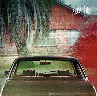
This another piece of album art which is used by an Indie band called 'The Arcade Fire'. I like this design cause it also looks fairly old fashioned, due to the 'posterised' effect which is applied to the photographs. If I were to incorporate photography into my design I would use Adobe Photoshop to establish a similar look to this one, and would use the saturation tool to dim the colours and give it an 'unpolished' look. Again, this design is fairly simplistic, with the logo kept fairly discrete in the corner of the design.

Yet again this album art is very
simplistic, with the sans se
rif text kept central on the design. I like the background featured as it looks handmade and again 'unpolished'. There is no particular colour scheme utilised on this which continues to build on the 'unpolished' look, which again corresponds with the 'indie' genre.
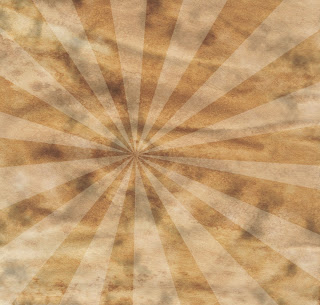
As a result of the album art research, I decided to experiment with backgrounds. Here are some of examples of backgrounds I created:
 I liked the old-looking background used on the "northern lights" album art, therefore I tried to create a similar effect on this background. For this I simply painted coffee over some paper and used a scanner to get the image on photoshop, then applied the desaturation tool to make it less bright and vivid.
For this background, I used the background I had made for the previous one but used Adobe Photoshop to edit it and give it a 'pop art' effect.
Initially I applied a 'clouds' filter above the paper layer, then changed the blending mode to 'hard light' and the opacity to 45%, so it looked like it was part of the paper.
Then I created a triangle shape using the line tool, and duplicated the layer whilst using the transform tool to create the 'burst' shape on the picture. To blend the shape with the rest of the image I changed the blending mode to 'Overlay' and changed the opacity to 32%.
Sir Ken Robinsons theory about Creativity.
In this video Sir Ken Robinson discusses creativity and how it happens. He states that "I do not mean to say that being wrong is the same thing as being creative. But what we do know is, if you're not prepared to be wrong, you'll never come up with anything original." What he means by this is that in order to create something original and creative, mistakes have to made to establish this. Creativity is achieved by sensory perception, meaning that in order to generate ideas you'll need to hear something, see, smell, touch or taste something in order to inspire you and create something original and innovative. He also states that creativity is something we are born with, and as you grow older you begin to lose creativity. This is because as people grow older, they establish a better idea of what is "right" and "wrong", thus will deliberately avoid making mistakes. I agree with the statements that Ken Robinson has made, and in this previous week I have had to make a variety of mistakes using Adobe Photoshop in order to learn what looks good and what does not, in order to create an outcome I am happy with. I also agree that inspiration is caused by sensory perception, as I usually come up with ideas whilst listening to music or after seeing something that I find aesthetically pleasing.


No comments:
Post a Comment